Pulse Lifesaving
A school project


PULSE Lifesaving is a full service training company focusing on lifesaving, first-aid and lifeguard training. PULSE hosts board certified training programs for individuals, groups and corporate clients. All of the programs are fully accredited by WSIB and the Royal Lifesaving Society. The main issue PULSE faced was their brand identity, as well as an aesthetic to bring in potential and preferred clients.
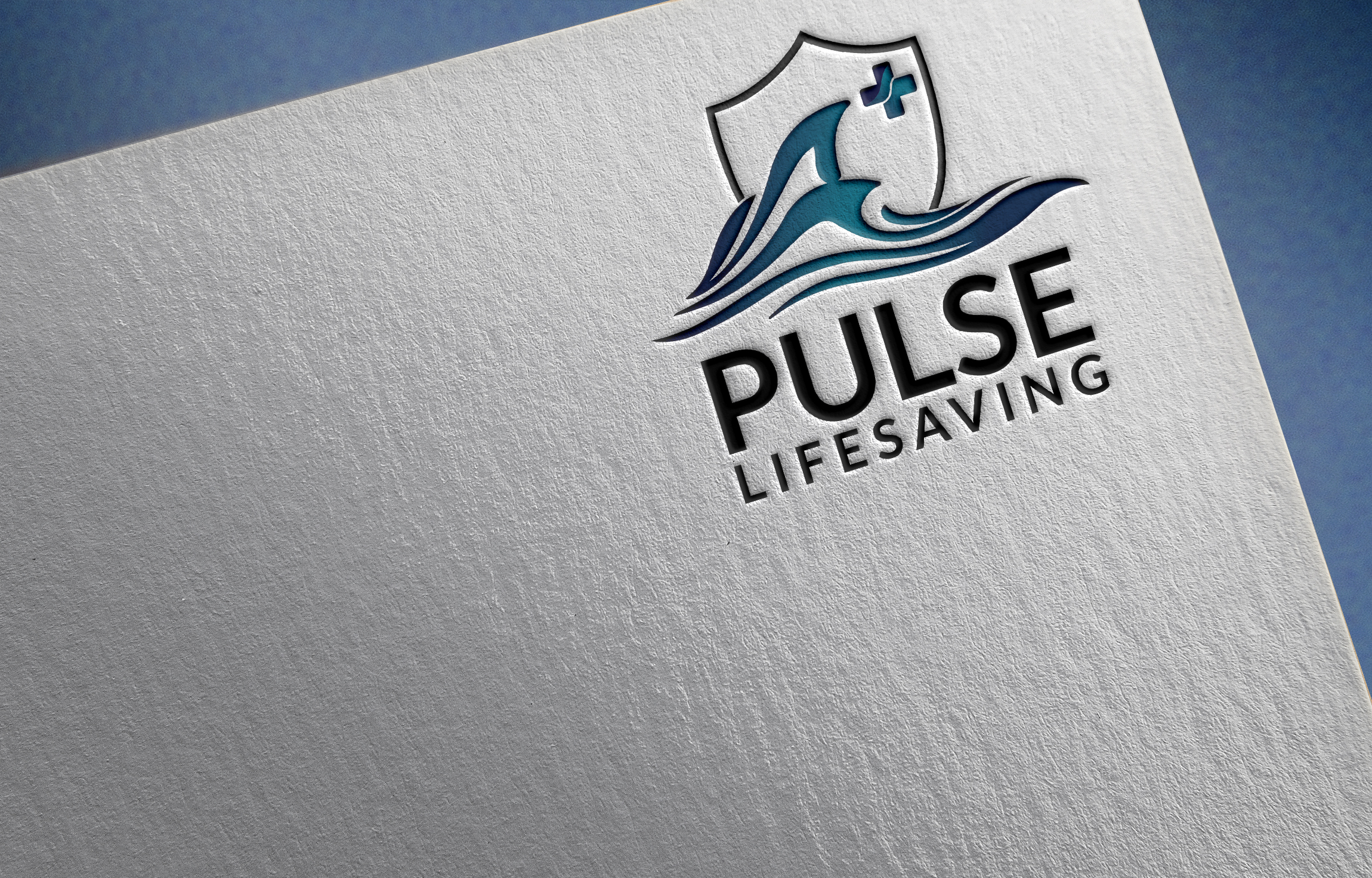
There is the use of a wave graphic to represent the water, which covers the lifeguard and life saving training aspect of their business. The cross was incorporated to represent the first-aid training, and finally the use of a crest as a part of the iconography gives the logo a sense of education and learning The font choice for this logo is bold and sophisticated, but isn’t too over powering. The font choice is clean and clear, and will standing out when compared to the others.
Colour theory is very important when marketing your brand and leaves an impression within seconds to the viewer. A specific colour palette in mind – turquoise, deep blue, dark gray, light blue and a custom gradient.
Gray is a cool, neutral, and balanced colour. The color gray is associated with formal, conservative and sophisticated. The colour also is a timeless and practical colour. Dark gray communicates some of the strength and mystery of black, but also carries the light attributes of the colour white.
Blue can be strong and steadfast or light and friendly. Blue is used to symbolize piety and sincerity in heraldry. Blue communicates significance, importance and confidence without creating a somber or sinister feeling to the viewer. Blue is considered a highly corporate colour, and is often associated with intelligence, stability, unity and conservatism. As you can see, there is a variety of blues used which invoke different meanings to the viewer. The darker blues can be seen as rich, elegant, sophisticated, intelligent and old-fashioned. Royal blues can represent superiority. Light blues will invoke honesty, and trustworthiness.
Turquoise, a blend of the color blue and the color green, has some of the same cool and calming attributes. The color turquoise is associated with meanings of refreshing, calming, energy, wisdom, serenity, wholeness, creativity, emotional balance, good luck, spiritual grounding, friendship, love, joy, tranquility, patience, intuition, and loyalty.
Darker shades of turquoise, such as teal have a more sophisticated feel. Variations of turquoise, which often is used to represent water, also is referred to as aqua and aquamarine.