Health First Vitamin Re-Brand
A school project


Health First competitors are offering various product lines to appeal to different target market segments. The product packaging is clean, clinical, minimal, modern and usually includes ‘clean, natural, organic’ motifs/naming conventions. White, green and bright, fresh colours run abundant.
Kids’ supplement packaging usually looks simultaneously clinical (so parents “know to trust it”) and fun, but cautiously so, with only minor elements that speak to their younger end-user (e.g.. animals, cartoons, recognizable trademark characters, etc.). Clinical white + Eye-catching candy colours, and flavours.
Health industry packaging in general is often depicted as “softly clinical” – trustworthy, higher-end, costly, but a “healthier, more natural approach to health hand wellness” – whether or not there is any fact in these claims – a lot of green-washing and sometimes pseudoscience is present. Lots of green, nature symbolism. Refrigeration of products that don’t necessarily need to be kept chilled, etc.
This project initially had 5 stages to it:
- Research,
- Initial sketches and concepts
- Create the labels,
- Create the professional mockups
- Present to the “Client” (client in this case was the teacher)
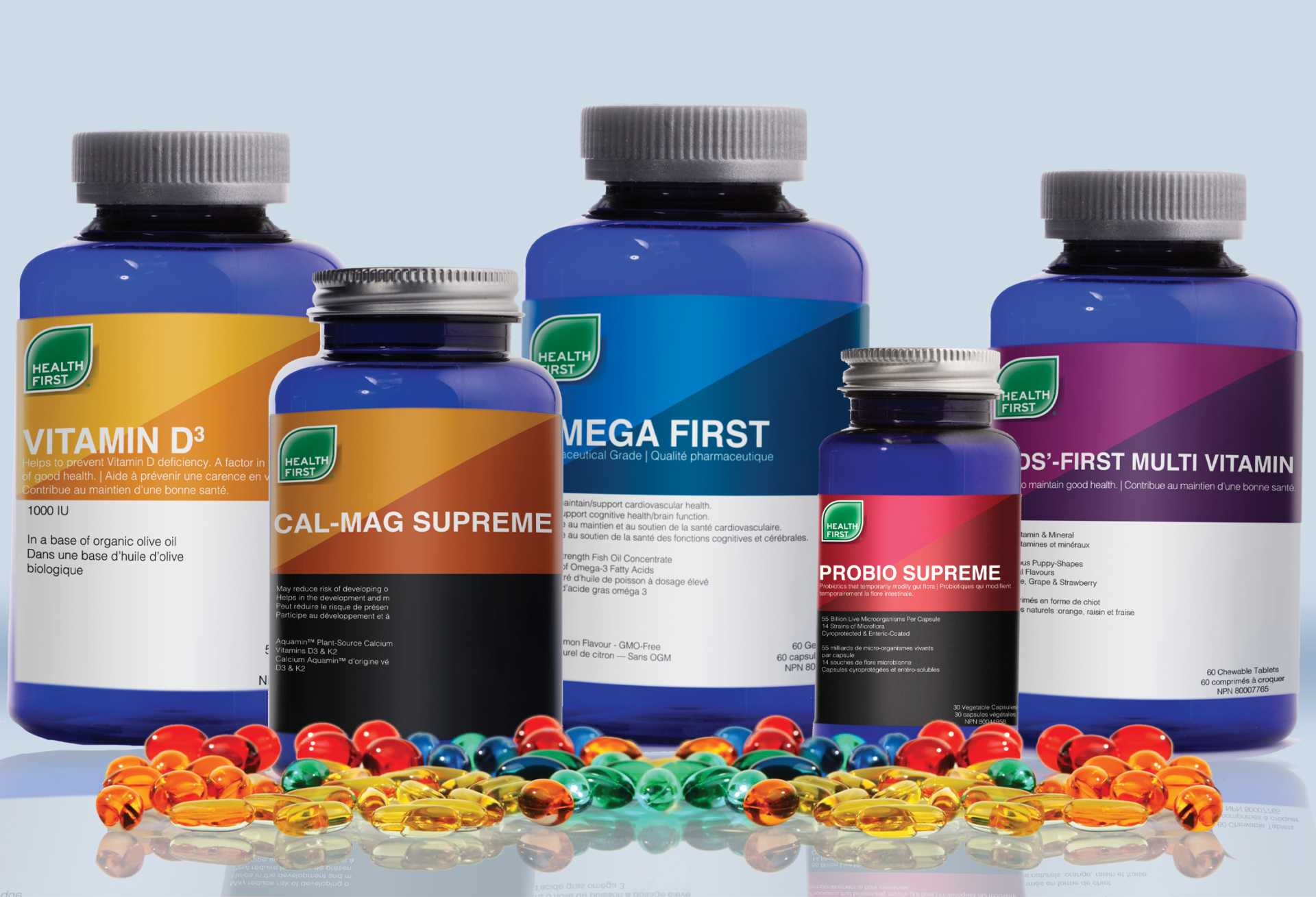
The initial start of this project was gathering the inspiration for the labels and the bottles. I was really inspired by The Ordinary Company and their clean labels and typefaces. Once the research and target market was created the next step were to create rough sketches of how the labels were going to look. The labels were created in Adobe InDesign, exported as JPGs and then mocked up in Adobe Photoshop. Once all the bottles and labels were created it then went into a presentation deck designed for the client with all the research, target audience information, the rough sketches and then each bottle presented as a mock up and then just the label as a print ready file.