Bennett Equine Veterinary Service
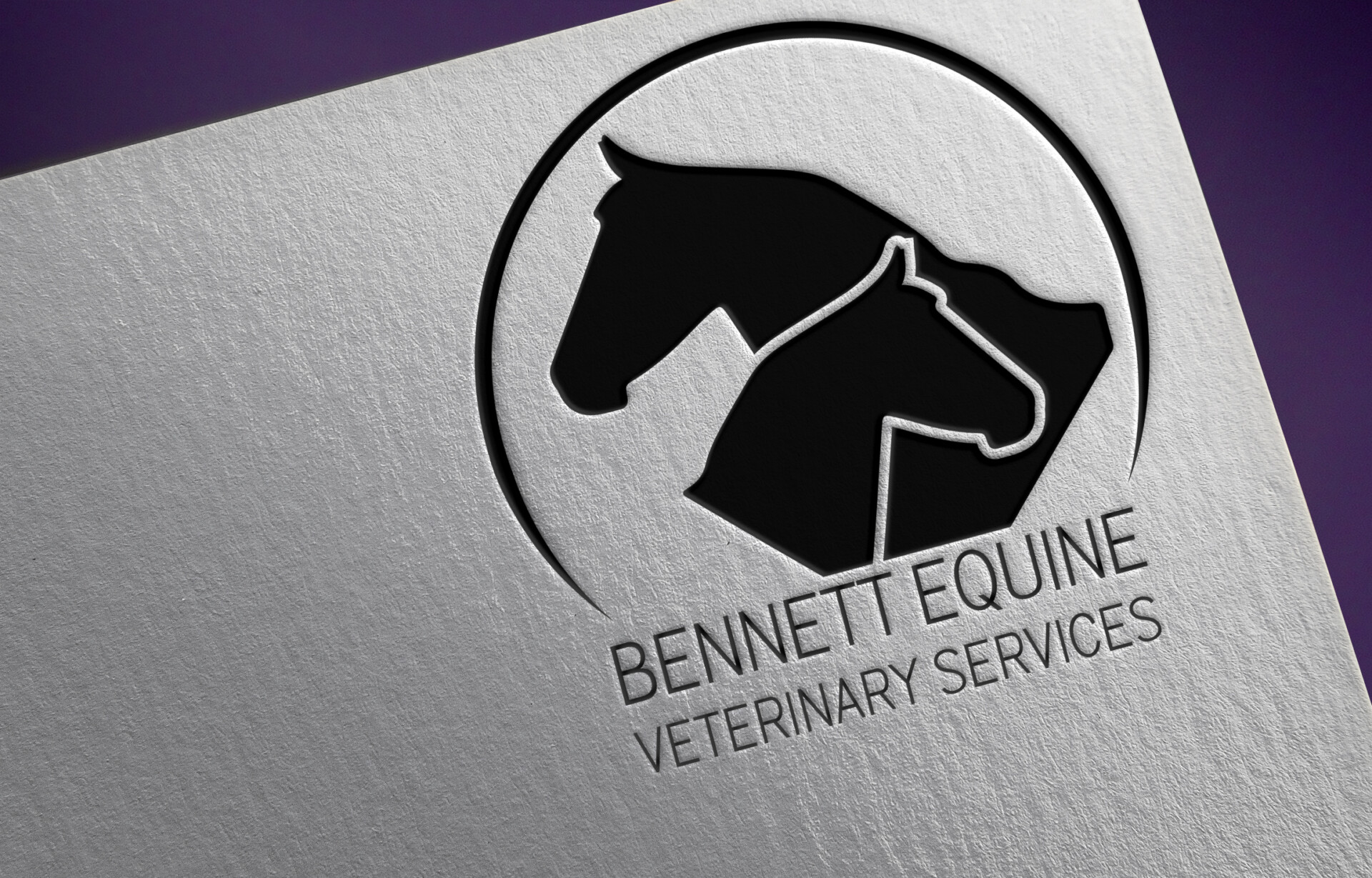
Bennett Equine Veterinary Services, owned by Dr. A Bennett, reached out when starting her own equine clinic when she was in need of a brand identity. The initial idea needed to include a clean and professional look while maintaining the identity of what their business revolves around – horses. The final logo encompasses two horses along with a semi-circle. The circle tends to send a positive emotional message of harmony and protection. When a circle is used in a logo it represented unity, commitment, love and community. Revealing another layer into the logo, circles have no beginning or end, and usually represent life and the life cycle.
The colour palette behind this logo was simple: Black. Keeping it a single tone allows for the logo to stand out and breathe. The secondary colour is a deep purple, which is found on their website. Purple combines the calm stability of blue and the fierce energy of red. The colour purple is often associated with royalty, nobility, luxury, power, and ambition. Purple also represents meanings of wealth, extravagance, creativity, wisdom, dignity, grandeur, devotion, peace, pride, mystery, independence, and magic.
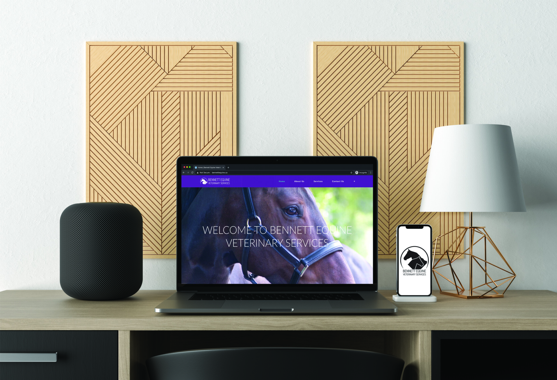
After the initial logo was created, Dr. Bennett needed a website to provide information to existing clients and draw in new clients as well. Each page of the website is simple and easy to understand. It includes a variety of services Dr. Bennett offers for her clients, a contact page with a custom form that is attached to her clinic’s email as well as a new patient care centre, where new clients can fill out their information and have the clinic contact them.
This website was created with WordPress, and a custom theme.
Website: www.bennettequine.ca